Converting visitors into registrants is a fundamental part of an event planning journey. Once you get people to your event website, you really want them to make that magic click that will get them signed up. So how do you impact registration decisions?
A strong event registration page can actually skyrocket ticket sales. And it’s the quality of a page that matters the most here. Not only should it look appealing, a high-converting event page has a range of functional elements and triggers that persuade a visitor to convert.
The key elements of a good event registration website
You can always let your creativity fly when it comes to building event registration experiences. In fact, with event expectations on the rise, adding some unique spice to your registration page can be a great move. Still, there are some basic event page anatomy rules that don’t have to be broken:
- Why, where, what, and when. If your event registration page doesn’t answer at least one of these questions, the chances are you won’t pack the house. No need to explain 25 sessions of your event or showcase 15 ways how people can get to the venue, one paragraph will be perfectly enough.
- Registration form. Have you ever been bored by an event registration form, having to provide tons of details before actually getting signed up? We know that story. Since one of the critical goals of an event organiser is to expand a contact base, capturing registrants’ data is definitely important. Still, it doesn’t mean you should ask people about their pets’ names. Keep it short and relevant.
- Ticket information. Clarify what people are paying for. This is particularly important if you develop several access categories for your event. There are three key aspects you should reflect here: the name of a ticket type, how much it costs, and what’s covered.
- CTA as a superstar. CTA is the next copy people read after reading a headline. A strategic wording, a highly visible spot, and great branding alignment are the secrets of successful CTA use.
The best examples of perfect event registration pages
We’ve collected the top 10 examples of good registration pages and forms that can inspire you on a website creation journey. To facilitate the most versatile insights, we’ve checked event websites of multiple types of organisations, from medical associations to corporations. Here’s what we came up with:
- MoneyConf: World’s leading tech conference with a focus on fintech
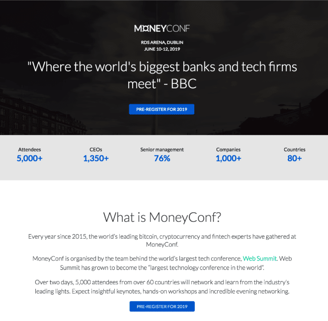
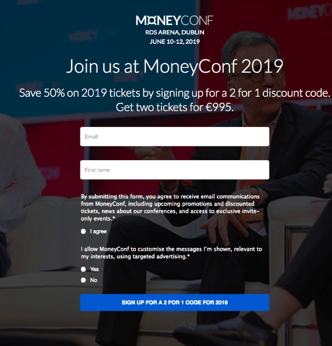
Simple and neat, MoneyConf pre-registration page is a good example of how you can demonstrate the value of an event to drive conversions.
The strongest point of this page is a value proposition: In a short copy, few figures, and a powerful testimonial from BBC, a visitor is explained how impactful the show really is. A vivid CTA that requires a very clear action is the second top-notch element.
Also, despite the page doesn’t include a ticket purchase form since the registration hasn’t started yet, it already entails a great conversion booster:
- IMCAS Congress: 3-days event dedicated to dermatology, plastic surgery, and aesthetic science
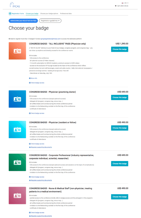
We know what you think: Too much text. But let’s dig a bit deeper. It’s a usual practice for scientific and academic conference organisers to develop multiple access packages. By clarifying who and why should choose a particular package you ensure registrants don’t stay in the dark about how they can get involved.
What’s good about the event website of IMCAS, they created a separate “Choose your badge” section and used color coding to build a logical flow. Registrants can also download the fees and check badge access information in the drop-down list.
- Black Deer Festival: Music festival in Kent
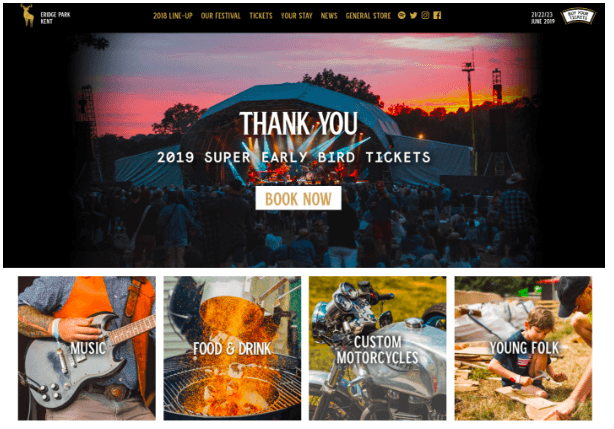
If you want a page to reflect the vibe of your event through visuals, check out the example of Black Deer Festival. “Super Early Bird Tickets” creates a sense of urgency, the value offer is demonstrated in four colorful images, and the photo on the background recreates festival atmosphere perfectly. Who needs copy here?
- Money 20/20 Asia: World’s leading payments events
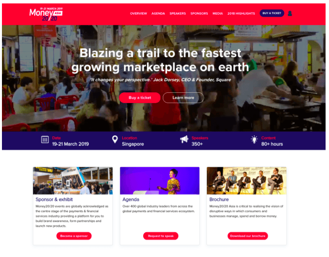
This event page is a good mix of “where, when, why, who” element, a vivid CTA, and few references to the informative sections. A simple copy idea, complemented by efficient branding can give you the best results.
- APMF Bali: Media business event
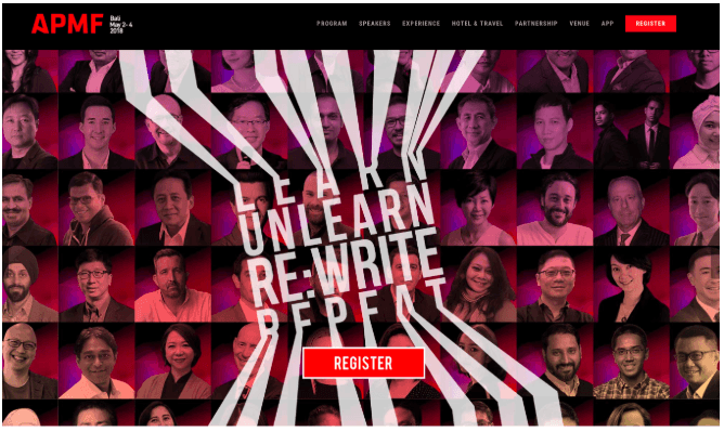
If you find an event website that demonstrates a better focus on the “Register” button, I’ll probably have to pay you for it 🙂 Excellent visuals and an on-brand CTA are really impactful here.
- Laureates Aviation Week: Awards event (recognition of special achievements in aerospace)
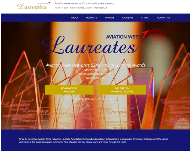
Registration websites for awards events might have a structure that is a bit different from the regular “buy a ticket” one. In case with awards and contests, a “Register” button usually means an application process which might be really sophisticated. The organisers of Laureates Aviation Week did a great move by splitting the journey into two parts through CTAs: one for the review of categories, and the second one for submitting an application.
- Seedstars Summit: The Entrepreneurship Forum for Startups
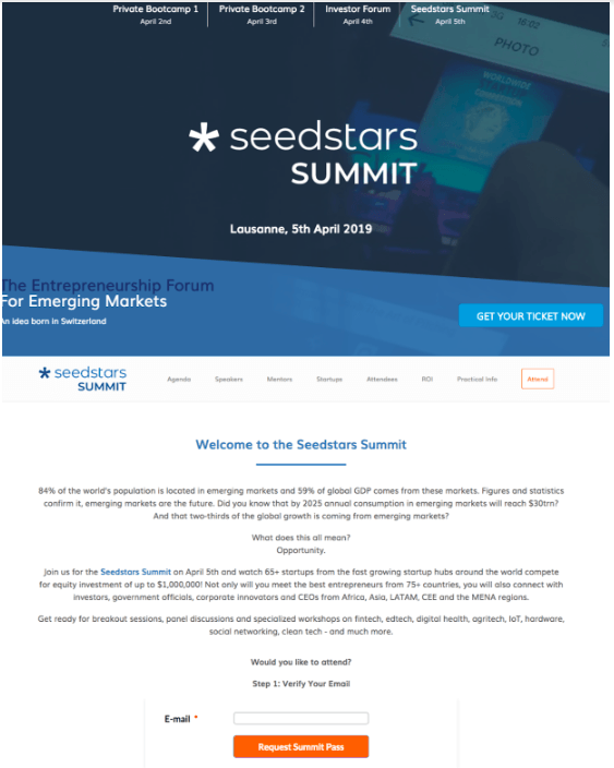
Seedstars Summit’s event page is a good example of how you can strengthen conversion potential. These guys used two different CTAs on a main page, both of which take a visitor to a sign-up section. Smart!
- TNW Corporate Conference: Tech conference in Amsterdam
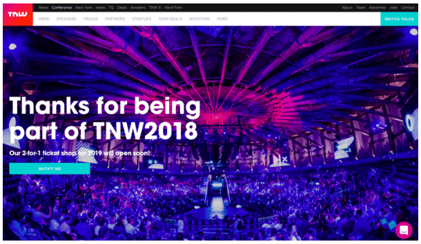
Unlike the examples above, this isn’t a dedicated event website, but a conference registration page embedded to a corporate website. TNW event atmosphere in one great image plus a strategic use of “Notify me” CTA create space for conversions even before the official registrations start.
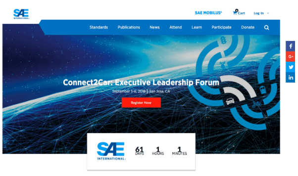
When you look at the page, your attention is instantly driven to the red button, just don’t deny it. Apart from a strategic use of contrasting colors, the second strong point is a countdown that creates a sense of urgency and anticipation.
- SXSW EDU: Annual international academic conference
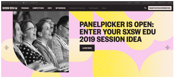
Academic events usually have their own rules when it comes to registration. For example, to get involved in SXSW EDU, you have to apply via email. From the example above you can learn how to drive engagement by transforming CTAs “Register” and “Tickets” into more neutral alternatives like “Register information.”
Conclusion
From a large-scale conference to a small academic contest, conversion boosting is a trick that you should use in any event promotion strategy. These examples of perfect registration pages should help you understand how to increase ticket sales through an event website.
