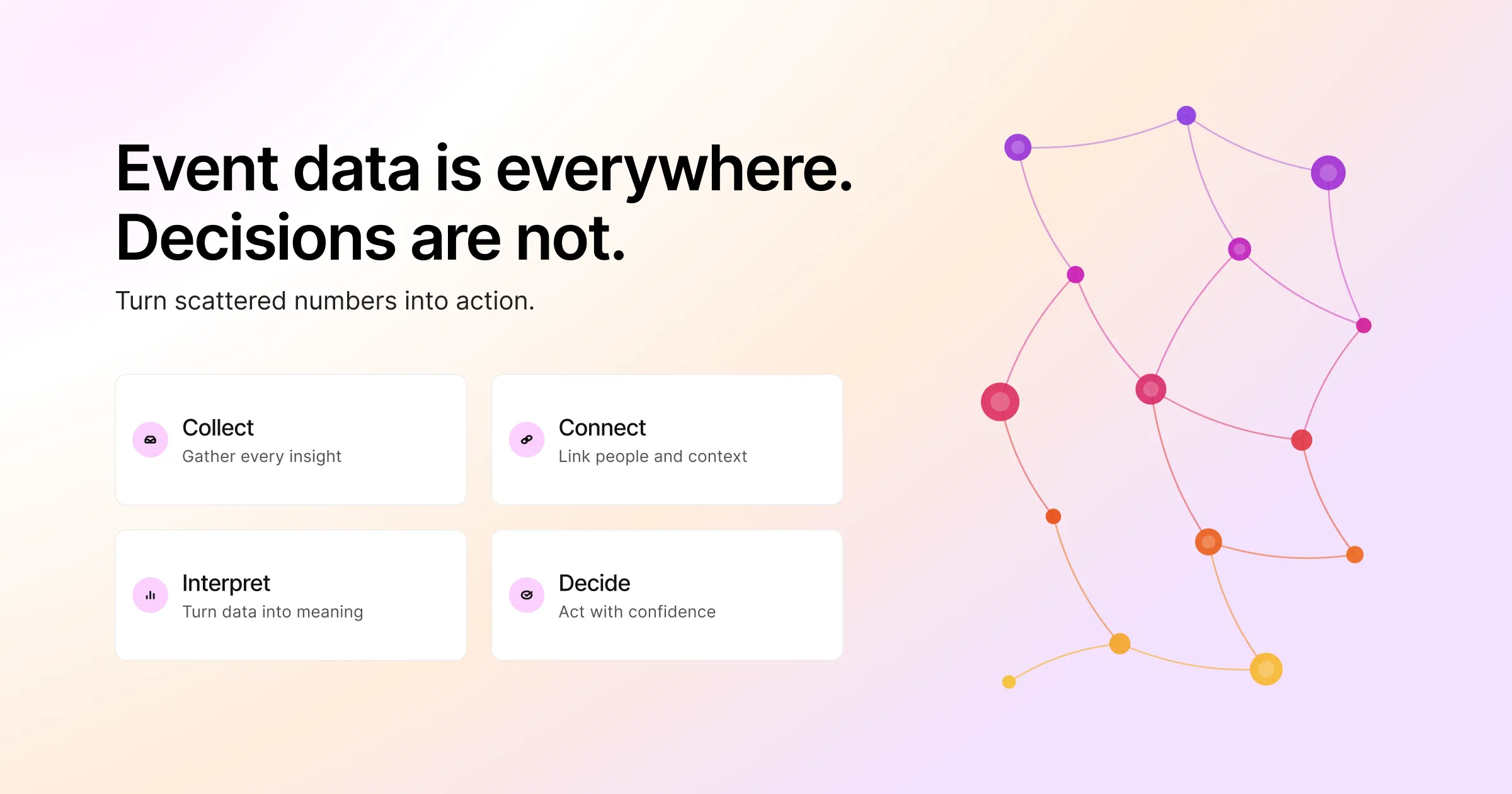
Most event teams do not have a data problem. Instead, they have a translation problem.
By the time an event wraps, the numbers are everywhere. Registration counts sit in one tool, while session attendance sits in another. Survey scores land in a spreadsheet. Meanwhile, badge scans, poll responses, app taps, and email opens all live in their own corners. In short, the data exists. What is missing is the part that turns all of it into a decision. Someone has to act on that decision on Monday morning.
That gap is what event data analytics is meant to close. Done well, event data analytics is not a post-event report that gets skimmed once and filed away. Instead, it is the practice of collecting the right event data, connecting it in one place, and reading it clearly. Once you read it clearly, you can change what you do next time. So you stop guessing which sessions mattered, which channels drove real attendance, and whether the event was worth the spend.
This guide walks through what event data analytics actually involves. It also covers which event data and event metrics are worth tracking. Next comes how to measure event ROI without pretending a single number tells the whole story. Finally, you will turn your event data into reports people read instead of ignore.
Key Takeaways
- Event data analytics is collection, connection, and interpretation. However, most teams do the first and skip the other two.
- Track event metrics tied to decisions. If a number changing would not change what you do, then it is a vanity metric.
- To measure event ROI, use the basic formula. However, you must define “value” honestly across revenue, pipeline, engagement, and brand.
- Set your measurement plan before the event starts, rather than after it ends.
- Scattered event data is the real obstacle. Connected data, in contrast, lets you read attendee journeys instead of isolated counts.
- Reports create value only when they lead with the decision, arrive fast, and match the reader.
What Event Data Analytics Actually Means
Event data analytics is the process of collecting attendee and operational data from across an event. You then bring it together and interpret it to improve decisions. In other words, the term covers three distinct things often lumped into one word.
The first is collection. Every touchpoint an attendee has with your event produces data. For example, it captures the form they filled in and the sessions they joined. It also captures booth scans, poll answers, and survey submissions. So collection means capturing that cleanly, without gaps or duplicates.
The second is connection. A registration record sits in one system, while a session-attendance record sits in another. They become useful only when they describe the same person in the same place. In practice, connection turns scattered event data into a single attendee journey.
The third is interpretation. This is the part most teams skip, because numbers do not explain themselves. For example, a 40% session drop-off means nothing by itself. First, ask why. Perhaps you scheduled it against the keynote. Alternatively, it ran long, or it simply did not deliver what the title promised.
When people say an event was “data-driven,” they usually mean all three happened. However, if they say they “had the numbers but no narrative,” then collection happened and the other two did not.
Event Data vs. Event Analytics: The Difference That Matters
It helps to separate two terms that people use interchangeably. Event data is the raw material, while event analytics is what you do with it. So the table below shows how the same input becomes something useful only after interpretation.
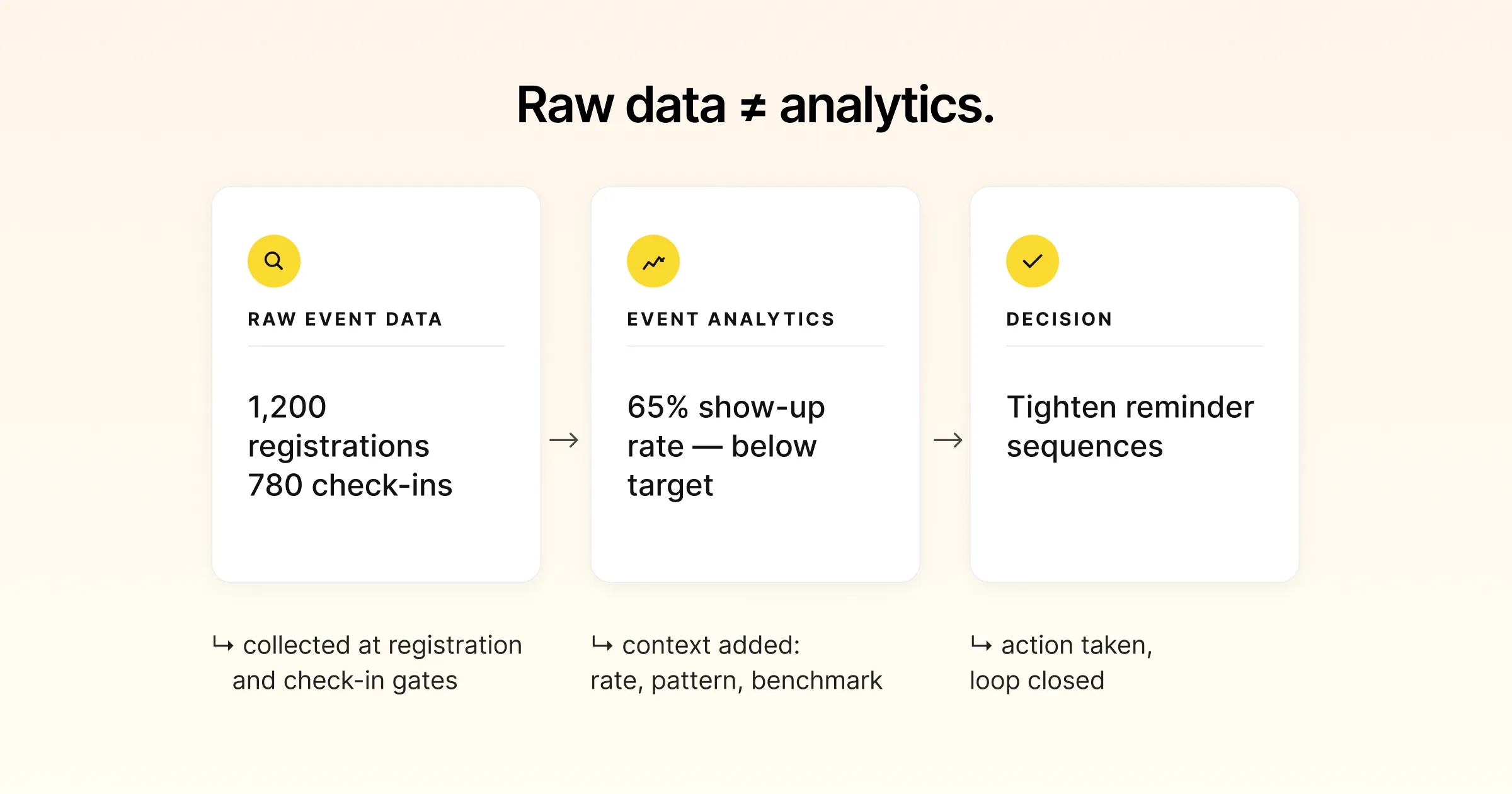
| Raw Event Data (what you collect) | Event Analytics (what it tells you) | Decision It Informs |
|---|---|---|
| 1,200 registrations, 780 check-ins | 65% show-up rate, below the 70% you expected | Tighten reminder sequences and confirmation flow |
| Session A: 300 joined, 90 left within 10 minutes | Early drop-off suggests a title-content mismatch | Rework the abstract or the speaker brief |
| Mobile app used by 54% of attendees | Nearly half never opened it | Rethink onboarding or the value the app offers |
| Booth scans concentrated in two of eight zones | Floor layout is steering traffic away from sponsors | Redesign the floor plan for the next edition |
The left column is common, because almost every event platform produces it. However, the middle and right columns are where the value is. That is why event data analytics is a skill and not just an export button.
The Event Metrics Worth Tracking (and the Ones That Waste Your Time)
Not all event metrics deserve equal attention. Vanity metrics feel good in a recap slide, yet they change nothing. In contrast, the metrics that matter are the ones tied to a decision. So a useful way to organise them is by the stage of the attendee journey they describe.
Pre-Event Metrics: Demand and Intent
These event metrics tell you whether your promotion is working. They also show where your audience comes from, before anyone walks through the door.
- Registration rate by source. In other words, which channels actually convert viewers into registrants, not just clicks.
- Registration completion rate. This is how many people who start a form finish it. So a low number points to friction, rather than weak demand.
- Time-to-register. This is how long the form takes to complete. Longer forms bleed registrations, especially on mobile.
Registration is where clean event data begins. If the record is incomplete or messy at sign-up, then every downstream number inherits the mess. That is why the quality of your event registration software shapes your analytics more than any dashboard does.
During-Event Metrics: Attention and Engagement
These describe what attendees actually did. In practice, that is usually different from what they registered to do.
- Check-in and show-up rate. Registered versus attended, so the gap is one of the most honest numbers you have.
- Session attendance and dwell time. Not just who joined, but also who stayed.
- Engagement actions. For example, poll responses, questions asked, chat activity, downloads, and app taps.
- Networking and matchmaking activity. For instance, meetings booked, connections made, and messages sent.
Post-Event Metrics: Satisfaction and Outcome
Finally, these close the loop between what happened and whether it was worth it.
- Net Promoter Score (NPS). In other words, “How likely are you to recommend this event?” on a 0 to 10 scale.
- Session-level satisfaction. This shows which content earned high marks and which did not.
- Lead quality and pipeline influence. For commercial events, this is the metric leadership cares about most.
- Content consumption after the event, such as on-demand views, replay watch time, and resource downloads.
A Simple Test for Whether a Metric Is Worth Tracking
Before you add a metric to a report, ask one question. If this number were twice as high or half as low, what would we do differently? If the answer is “nothing,” then it is a vanity metric. Drop it. Attendee count on its own usually fails this test. However, show-up rate, session dwell time, and lead quality usually pass it.
How to Measure Event ROI Without Oversimplifying It
Sooner or later, someone asks the question every event metric feeds into. Was it worth it? To measure event ROI, you need a formula. However, you also need honesty, because one formula rarely captures the full return.
The Basic Event ROI Formula
In practice, the calculation is straightforward:
Event ROI (%) = ((Total Value Gained − Total Cost) ÷ Total Cost) × 100
If you spend 50,000 and the event generates 150,000 in attributable value, then your ROI is 200%. Industry guides commonly cite average event ROI in the range of 200% to 500%. In other words, every dollar spent returns roughly two to five dollars. That said, the real figure varies widely by event type and how you define value.
Why the Formula Is the Easy Part
The hard part is the words “value gained.” For a paid conference, value might be ticket revenue. At a B2B field event, however, it is pipeline influenced over a sales cycle. That cycle can run six to nine months or longer. Meanwhile, in a community or brand event, value shows up as retention, advocacy, and relationships that never appear on a single invoice.
That is why mature event teams measure event ROI across more than one dimension. For example, the table below breaks the most common ones down.
| ROI Dimension | What You Measure | Best For | Time Horizon |
|---|---|---|---|
| Direct revenue | Ticket sales, on-site purchases, sponsorships | Paid conferences, trade shows | Immediate |
| Pipeline influence | Qualified leads, opportunities created, deals influenced | B2B and enterprise events | 90 to 180 days |
| Engagement value | Session attendance, content consumption, app activity | Internal and product events | During and shortly after |
| Brand and relationship value | NPS, sentiment, repeat attendance, referrals | Community and flagship events | Across editions |
Set the Measurement Plan Before Doors Open
The single most common reason teams cannot measure event ROI is simple. They decide to measure it after the event is over. By then, nobody has set up the tracking that would make attribution possible. So build your measurement plan while you build your event plan. Decide what value means, which event data proves it, and where that data will live. Do that before you send the first invite.
Want every event number in one place instead of five spreadsheets? Then see how a unified event data platform connects registration, on-site, and engagement data into a single view.
Pro Tip:
Before your next event, write down the three questions you want it to answer. Then work backwards to decide which data point proves each one, and where it will live. Teams that set this up before doors open can measure event ROI cleanly. However, teams that decide after the event ends spend weeks stitching spreadsheets together. Yet they still cannot answer the question leadership actually asked.
Why Scattered Event Data Is the Real Obstacle
Ask event teams why their analytics feel thin, and the answer is rarely a lack of data. Instead, the data lives in too many places to read together.
A typical event runs across a registration system, an email tool, and an event app. It also runs an on-site check-in setup, a survey platform, and often a CRM. Each captures a slice of the attendee, yet none sees the whole person. So try answering a simple question. Did the people we invited by email actually attend the sessions we recommended? You cannot, because the email data and the session data never meet.
This is the difference between having event data and having event analytics. After all, fragmented data can only ever answer fragmented questions. In contrast, a connected data model answers the questions that actually matter, because it follows one attendee across every touchpoint.
What a Connected Attendee Journey Looks Like
When event data flows into one place, a single attendee record can tell a continuous story:
- First, they registered through a LinkedIn campaign and completed the form in under two minutes.
- Next, they opened two of three reminder emails and checked in on time.
- Then they attended three sessions, stayed for all of the keynote, and left one talk early.
- They also booked two matchmaking meetings and scanned four sponsor booths.
- Afterward, they rated the event 9 out of 10 and downloaded two resources.
That is not five metrics. Instead, it is one journey. Moreover, a journey is something you can act on, because it shows cause and effect rather than isolated counts. Gevme builds its approach to on-site event management and registration on a single data model. So they share it rather than sitting in separate tools.
Turning Event Analytics Into Reports People Actually Read
A report only creates value if someone reads it and changes a decision because of it. However, most post-event reports fail this test. They are long, they arrive late, and they lead with numbers instead of meaning.
Lead With the Decision, Not the Dashboard
A stakeholder does not want to open a report and hunt for the point. So start with the answer. Was the event worth it, what worked, what did not, and what should change next time. The supporting data comes after, for the people who want to dig in.
Report Fast, While the Data Still Has Power
Event analytics loses value quickly. A recommendation that lands two weeks after the event can still shape the next cycle. Three months later, however, the same recommendation competes with a dozen new priorities and usually loses. So a good rule is a preliminary read within two weeks, then a final report within 30 days.
Match the Report to the Reader
Different audiences need different cuts of the same event data. As a result, one report rarely serves all of them well.
| Audience | What They Care About | Lead Metric |
|---|---|---|
| Leadership | Was this worth the investment | Event ROI and pipeline influence |
| Marketing | Which channels and content performed | Registration by source, engagement rate |
| Event operations | What ran smoothly and what did not | Check-in speed, session attendance |
| Sponsors | What they got for their money | Booth scans, leads, meeting count |
A Practical Framework for Event Data Analytics
If you want to move from scattered numbers to real event analytics, start with a simple four-step loop. It works across event types and sizes.
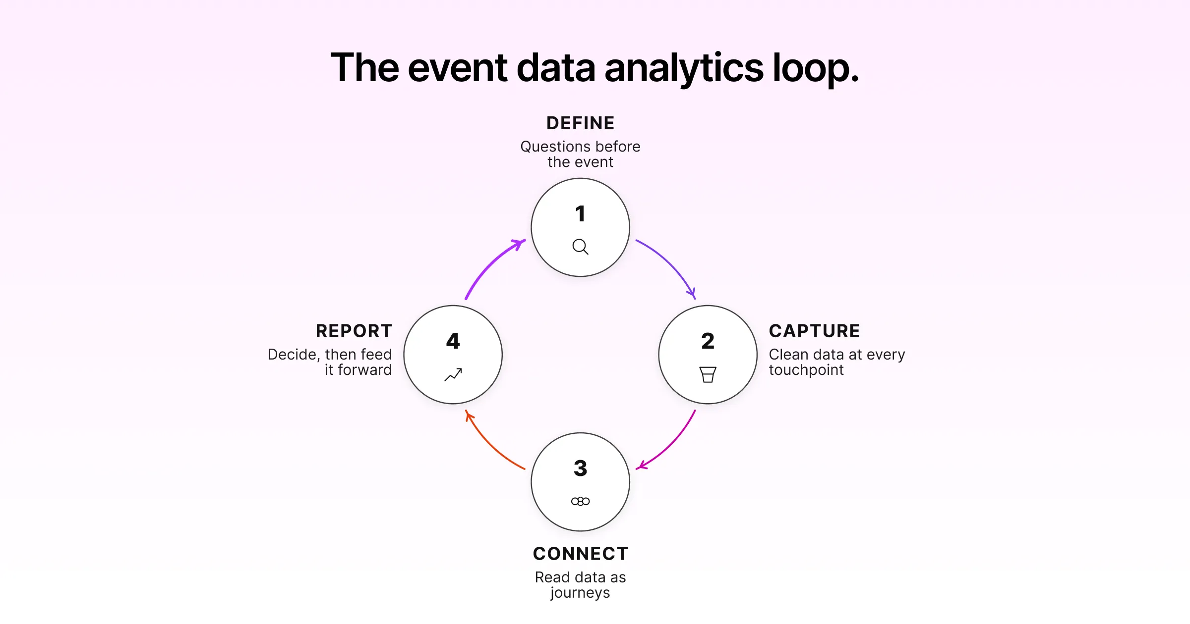
Step 1: Define the Questions Before the Event
First, write down the three to five questions you want the event to answer. “Which acquisition channel brings attendees who actually show up?” is a real question. However, “How many people came?” is not, because it does not point to a decision.
Step 2: Capture Clean Data at Every Touchpoint
Next, configure registration, check-in, sessions, and surveys so each one records the data your questions need. Also make sure records connect to the same attendee. In practice, clean capture at the source is worth more than any amount of cleanup later.
Step 3: Connect and Read the Data as Journeys
Then bring the data into one place and read it as attendee journeys, not isolated counts. This is where patterns appear. For example, one channel looks great on registrations but weak on show-up. Another session fills up and empties out.
Step 4: Report, Decide, and Feed It Back
Finally, turn the reading into a short, fast report that leads with decisions. Then feed what you learned into the next event’s plan, because this is the step that compounds. In other words, event data analytics is a loop, not a one-time export.
Frequently Asked Questions
What is event data analytics?
Event data analytics is the process of collecting attendee and operational data from across an event. You then connect it into one view and interpret it to improve decisions. So it covers three parts. First, capture clean data at every touchpoint. Next, link those records to the same attendee. Finally, read the result to understand what actually happened and why. The goal is not a report for its own sake. Instead, it is better decisions about content, channels, and spend on the next event.
What event metrics should I track?
Track event metrics tied to decisions, grouped by journey stage. Before the event, watch registration rate by source and completion rate. During the event, watch show-up rate, session attendance, dwell time, and engagement actions such as polls and questions. After the event, watch NPS, session-level satisfaction, and lead quality or pipeline influence for commercial events. Finally, skip metrics that would not change any decision if they moved.
How do you measure event ROI?
Measure event ROI with the formula ((Total Value Gained − Total Cost) ÷ Total Cost) × 100. However, the challenge is defining value. For paid events it is revenue, while for B2B events it is pipeline influenced over the sales cycle. For community events, meanwhile, it is retention and advocacy. Mature teams measure ROI across several dimensions, rather than one number. They also set the measurement plan before the event begins, so the tracking exists when they need it.
What is the difference between event data and event analytics?
Event data is the raw material, such as registration counts, check-in scans, and survey responses. By contrast, event analytics is what you do with that data. You connect it, interpret it, and turn it into a decision. On its own, event data tells you what happened. Analytics, however, tells you why it happened and what to change. So most teams have plenty of event data and very little event analytics.
Why is my event data scattered across so many tools?
Because a typical event runs on separate systems for registration, email, and the event app. It also runs on-site check-in, surveys, and the CRM. Each captures one slice of the attendee, yet none sees the whole person. The fix is a connected data model where every touchpoint feeds the same attendee record. As a result, you can read a continuous journey instead of stitching together fragments after the fact.
When should I send my post-event report?
Fast. Aim for a preliminary read within two weeks, then a final report within 30 days. Event analytics loses power as time passes, because recommendations that land late compete with new priorities. So they rarely change anything. Finally, lead the report with the decision and keep it short. Then give each audience the cut of the data they care about.
Conclusion: Data Is Only Useful When It Becomes a Decision
Every event you run already produces more data than you use. However, the teams that pull ahead are not the ones with more numbers. Instead, they connect the numbers, read them as journeys, and turn them into decisions fast enough to matter.
That is the whole promise of event data analytics. Not a fuller dashboard, but a clearer answer to the questions that shape your next event. Namely: what worked, what did not, and what to do about it. So get that loop running. Then each event teaches the next one how to be better.
Ready to stop exporting spreadsheets and start reading attendee journeys? Then explore how Gevme brings registration, on-site, and engagement data into one place. Alternatively, request a demo to see it with your own event data.