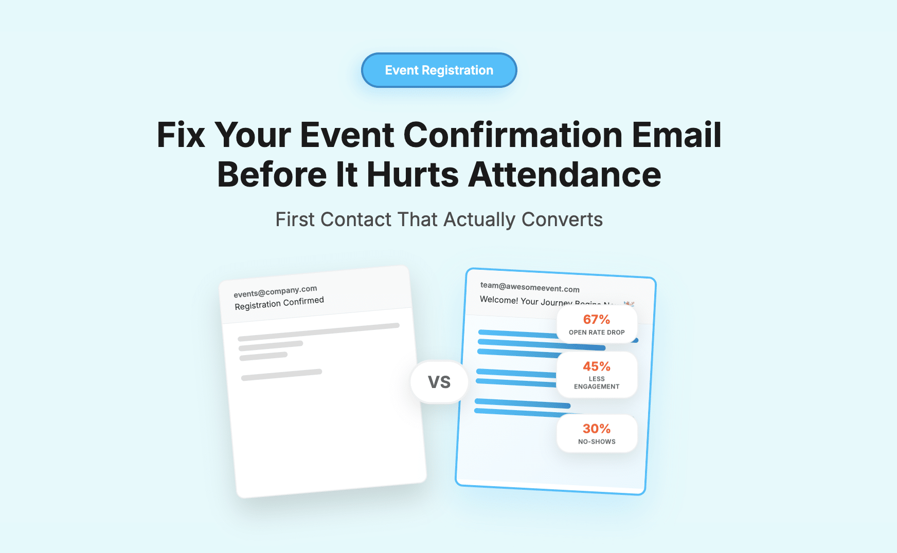
By the time someone registers for your event, you’ve likely done a hundred things right. The landing page worked. The copy converted. The timing hit. They clicked.
And then… silence.
Or worse that email. The one that says:
“You’re in. Add to calendar.”
No tone. No story. No sense of what they just said yes to.
And that’s the problem.
Most teams treat the confirmation email as a logistics task. But for your attendee, it’s the first real moment of contact – the first time your event stops being a promise and starts becoming an experience.
And too often, that moment falls flat.
The False Sense of Closure
Inside the team, a registration is seen as a finish line. The user converted. The journey worked. Success.
But for the attendee, it’s not the end – it’s the beginning of a new kind of decision-making.
They may have signed up, but they’re still deciding:
- How important is this, really?
- Will I actually show up?
- What should I expect – and is it worth the time?
- Do I need to prep, plan, engage?
If your confirmation email doesn’t speak to those questions – if it doesn’t even recognise that those questions exist – you’re missing a critical opportunity to shape behaviour, perception, and confidence.
The Email That Gets Read the Most… And Worked on the Least
There’s a reason confirmation emails routinely outperform all your other email metrics:
They’re expected. They’re immediate. And they’re useful.
The open rates? 60 to 80 percent. Inboxes treat them as important. Attendees do too – at least for a moment.
But most of these emails are written like system receipts. Sanitised. Stripped of tone. Meant to check boxes, not stir interest.
Which is odd, because this is the one email that goes to every attendee. Not just those who clicked your ad. Not just those who opened the newsletter. Every single person who might show up at your event sees this.
And it says almost nothing.
A Design Problem Disguised as Admin
Let’s be honest – no one in most teams is really designing the confirmation email. It gets generated, maybe edited slightly, and deployed from the registration tool.
Which means it lives in a no-man’s land.
Not quite marketing. Not quite ops. Not quite UX. And because it doesn’t belong to anyone, it doesn’t get designed with intent.
But this isn’t just a missed marketing opportunity – it’s a missed experience opportunity.
If your first post-registration interaction feels like a robotic receipt, that’s the tone you’ve now set.
Compare that to an email that opens with:
“You’re in. And here’s what you just signed up for – not in agenda points, but in promise.”
Suddenly it’s not just a transaction. It’s a relationship.
Confirmation Emails Don’t Prevent No-Shows – They Cause Them
There’s a quiet cascade that begins with a weak confirmation email:
- The attendee doesn’t really feel welcomed.
- They’re unclear about what to expect or why it matters.
- They deprioritise the event – mentally or literally.
- They don’t block their calendar, or prep, or engage.
- They skip. Or they show up confused, unengaged, ready to leave early.
And often, when organisers try to fix this, they go to the wrong place – reminder emails, pre-event calls, session nudges.
All of which are important. But if your very first message didn’t land, you’re already playing catch-up.
Function Over Fluff
None of this means you need to be poetic. Or witty. Or clever for the sake of it.
It means you need to treat the confirmation email as what it really is: a structural part of the experience.
It should:
- Remind the attendee of why they signed up
- Set expectations: what’s next, when to look out for info
- Outline how to get the most out of the experience
- Feel like it was written by a human, for a human
And yes – all of this can be done in a few clear, well-placed lines. But they have to be written with intent.
The Fix Is Small – But the Shift Is Big
Most registration platforms will let you edit your confirmation emails. And even if you’re stuck with basic formatting, you can still make the content work harder.
Try this:
- Replace “You’re registered” with a line that shows you see them:
“We’re glad to have you on board for the [Fintech Roundtable] – especially with the work you’re doing at [Company].” - Outline next steps with a timeline, not just bullet points:
“Here’s how the next few weeks will play out: agenda preview, access pass, prep kit.” - Add tone without adding fluff:
“You’ll hear from us again soon. Until then, block your calendar – and know that we’re working to make every minute of this worth it.”
Small shifts. Big impact.
In the End, It’s a Choice
You can treat confirmation emails as admin. Or you can treat them as an opening chapter.
You can send a receipt. Or a welcome.
One says, “Transaction complete.”
The other says, “We’re just getting started.”
Which one do you want people to remember?
FAQ’s
The confirmation email is often the first real touchpoint after registration. It sets the tone for your event, shapes attendee expectations, and can significantly impact show-up rates. A thoughtful email builds trust and excitement.
Many treat confirmation emails as mere receipts—overly formal, tone-deaf, and lacking detail. This ignores the attendee’s emotional journey and misses an opportunity to reinforce their decision and build anticipation.
By clearly communicating value, next steps, and what to expect, confirmation emails increase the perceived importance of the event. This makes attendees more likely to prioritize it and prepare accordingly.
A strong confirmation email should:
Acknowledge and welcome the attendee
Reinforce the value of the event
Set expectations with a simple timeline
Provide helpful next steps
Be written in a human, conversational tone
Yes, Gevme’s event platform allows for customizable confirmation emails that align with your event branding and messaging. You can create warm, engaging emails that do more than confirm—they connect.
