

The number of attendees will either make or break an event. That is why we as event organisers have to spend a great deal of our effort on event marketing, which starts with event landing page design inspiration. There is no better place than a well-designed event landing page to tell your audience exactly why they should come to your event and what value they will get from attending.
Today we at Gevme will share with you the guidelines for building an event landing page that converts and three amazing event page examples in 2019.
The 6 Elements of an Event Landing Page that Converts
#1 Unique value proposition
Your event landing page exists to serve one purpose: to persuade people to come to your event. As such, it needs to clearly shout out why people should choose your event over any of the other events out there.
Think about something that visitors to your landing page won’t find easily anywhere else. It could be many things, such as their first visit to the city, once-in-a-lifetime deals, world-famous speakers, a reunion, a competition with attractive prizes, life-changing knowledge, etc.
#2 Image
Do you enjoy reading a flyer full of text? No? Then you shouldn’t expect your visitors to enjoy it either. Convey the energy and excitement of your event through an image or, even better, a video.
Capture the best moments of your last event or use product teaser images to make people feel curious and excited to know more.
#3 Benefits
List the solid reasons to go to your event. Remember to target the right audience. The benefits should be very straightforward, practical, and appealing. If people are intrigued by your event’s unique value proposition, this will entice them to attend.
#4 Social proof
Humans, after all, are social animals. We want to do the same things other people are doing. We want to follow the trends and be fashionable. We don’t want to lose out to our peers, so prove that your event is approved by the crowd!
#5 Online registration
Your call-to-action button of “Register Now” or “Buy Your Ticket” should be placed clearly and prominently on your event landing page. Don’t forget to add a sense of urgency or to demonstrate the benefits of your ticket policies to get people to decide on the spot.
#6 Mobile-optimization
Over half of all web traffic now comes from mobile devices, so be sure your landing page is mobile ready.
How we evaluate
By taking into account all of the above-mentioned elements that a perfect event landing page should have, Gevme evaluates the landing page’s effectiveness. The main task of the landing page is to convert traffic from clicks to leads. Without traffic, it is impossible to do this. Understanding if the landing page is well made or poorly made, what its quality is, what is most viewed, etc., is simply impossible without a CTA button and the web metrics services you use for checking the audience and their visits to the pages. Below are the top pages we’ve evaluated.
The 3 Amazing Event Landing Page Examples for 2019
Enough of the theory? Let’s learn through the real case studies now.
#1 The World’s Leading AI Summit
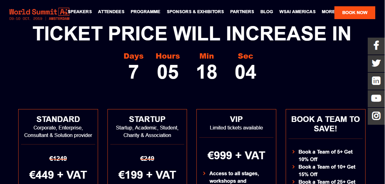
This is a shining example of a well-thought-out event registration landing page that starts with a video collage and brightly animated visual elements with useful content and inspiring photos. The page managed to cover all the most useful data on the event with the objective of focusing on everyday lives across society and linking them to AI communities, products, and services.
#2 Unbounce Call to Action Conference 2018

This is quite an informative event landing page example. It is embroidered with the photo materials and useful articles that expand the vision of the event and the viewer’s understanding right from the start: speakers, content and coverage, the schedule, and reasons to come are quite persuasive in combination with an awesome design that seems more like a newsletter than a website page, which produces the effect of great personalization.
#3 Rise HONG KONG
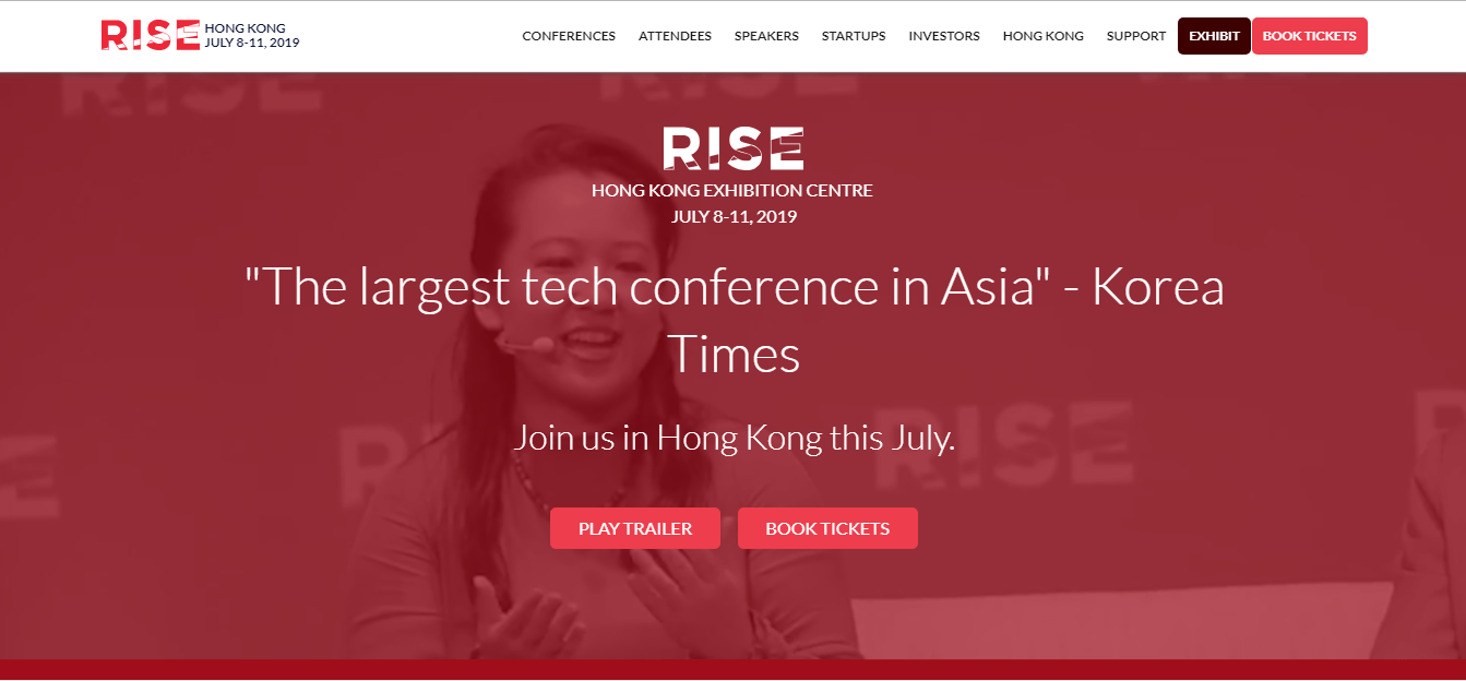
This is another visual event landing page inspiration with a lot of design, from the quote to outstanding content, ideal photo placement, the right CTA buttons, and organically placed keywords—all revealing the greatest moments of the event. Needless to say, this is also a bright, well-structured, and carefully designed page with good usability and a great conversion rate.
Tips on what to do to make your page cool
To make a great landing that really sells, you should stick to a couple of simple rules:
● Write clear and understandable headlines.
The title is read by all visitors. They study the page and click on the link. Remember: It’s better to be simple than so complex that it’s incomprehensible.
● Useactive verbs in your CTA.
This way you are pushing the reader to action.
● Make a great design.
Use one proven best practice design landing page. Visually highlight the title, for example, centre it, and add a contrasting colour.
Make the content of the landing page impeccable. Remove all unnecessary words. Do not rely only on yourself for proofreading, either. You may not notice some of the errors, so give the material to a professional to check out.
Do you have some additional insights about landing pages for event marketing? Feel free to share your thoughts in the comments.
Need help with designing a top-notch landing page for your event?


