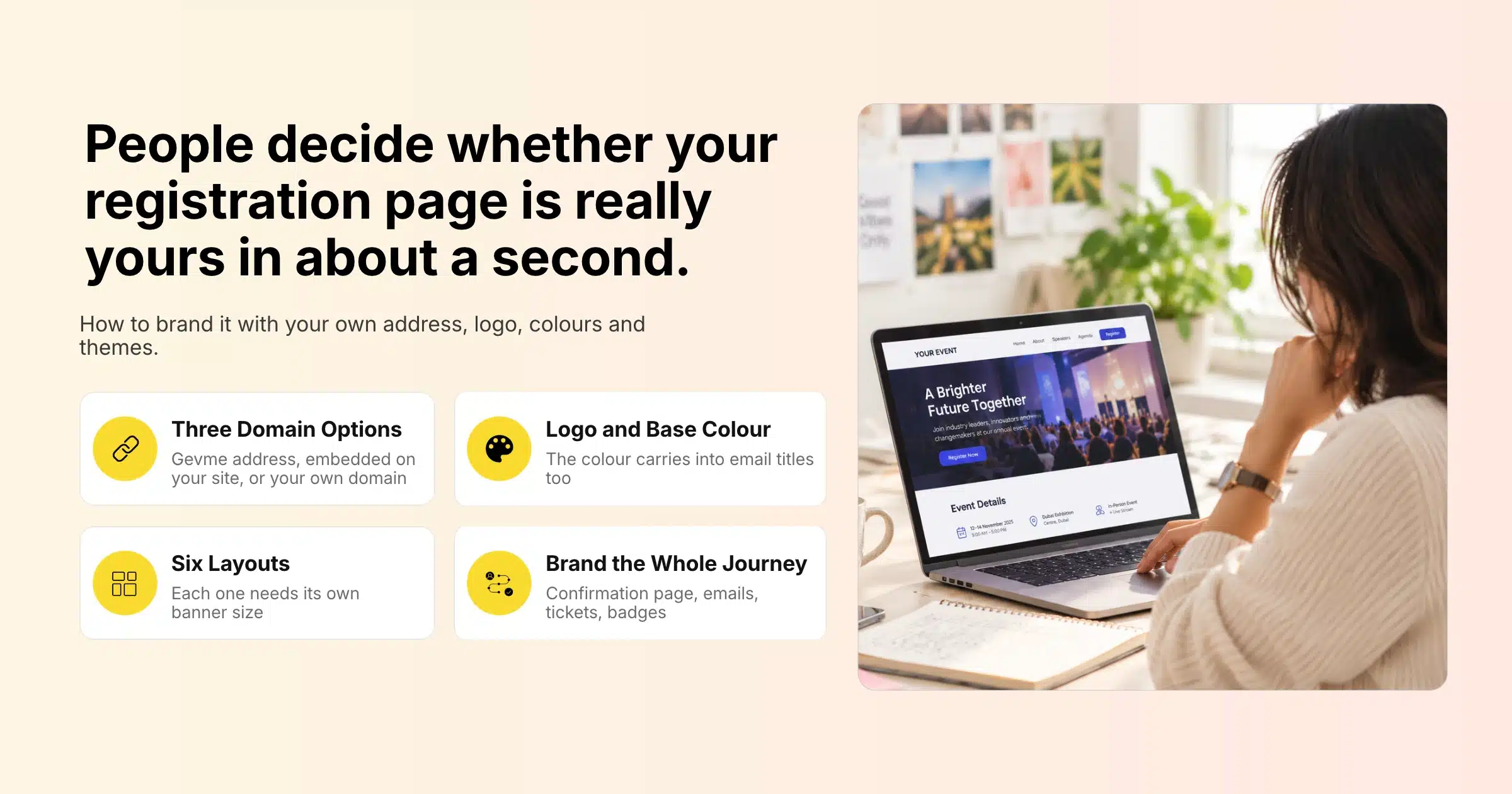
Your event registration page is often the first real contact someone has with your event. They click a link in an email, a LinkedIn post or a partner newsletter, and within a second or two they decide whether the page feels right. If it looks like your brand, carries your logo and sits on an address they recognise, they keep going. If it looks generic, mismatched or slightly off, some of them close the tab, especially when the page asks for payment details.
An event registration page is the web page where people sign up or buy tickets for your event. Branding it means making that page look and feel like your organisation: your web address, your logo, your colours, your images and your tone of voice, carried through to the confirmation page and the emails that follow. Good branding builds trust, makes the event feel established and keeps the whole sign-up journey consistent with the rest of your marketing.
This guide covers why branding your registration page matters, the elements you can brand, your options for custom domains, how to prepare logos and banner images, how registration layouts and website themes work, how to keep your brand consistent after someone registers, and a step-by-step setup in Gevme.
Key Takeaways
- Brand every part of the sign-up journey, from the registration page through to the confirmation page, emails, e-tickets and badges, so attendees never feel they have left your event.
- Choose your web address strategy early: a clear Gevme event web address, registration embedded on your own website, or a full event website on your own custom domain.
- Prepare a clean logo file and a banner image sized for the registration layout you plan to use before you start building.
- Set a base colour that matches your official brand colour, because it carries through to the event title, links and email titles.
- Customise the Open Graph image and description so your event looks polished when the link is shared on social media and messaging apps.
- Also use an organiser profile with a sender name and email that attendees will recognise in their inbox.
- Test the page on desktop and mobile, and check every image and colour before you publish.
Why Branding Your Event Registration Page Matters
Branding your event registration page matters because people only register when they trust the page in front of them. A consistent, recognisable page answers three silent questions: is this the real event, is it run by the people I think, and is it safe to enter my details here?
Trust and Payment Confidence
After all, attendees are cautious about where they type card details. A page that carries your logo, matches the colours of your website and email, and shows a clear organiser name reassures people that they are in the right place. By contrast, a plain or mismatched page makes some of them stop and check, and a share of those never come back.
A Consistent First Impression
Your marketing team spends weeks on campaign visuals, speaker graphics and email design. When the click lands on a registration page that looks nothing like those assets, the momentum drops. Consistent branding keeps the same story going from the first ad to the final confirmation email.
Sponsor and Partner Value
For many events, sponsors and partners promote the registration link to their own audiences. A polished, branded page reflects well on them too, and it makes partner promotion easier because the page looks like a proper destination.
Recognition for Repeat Events
If you run a yearly conference or a regular event series, a consistent look helps past attendees recognise your event straight away. Repeat registrants move through a familiar page faster, and that familiarity carries real weight when someone is deciding whether to come back.
What You Can Brand on an Event Registration Page
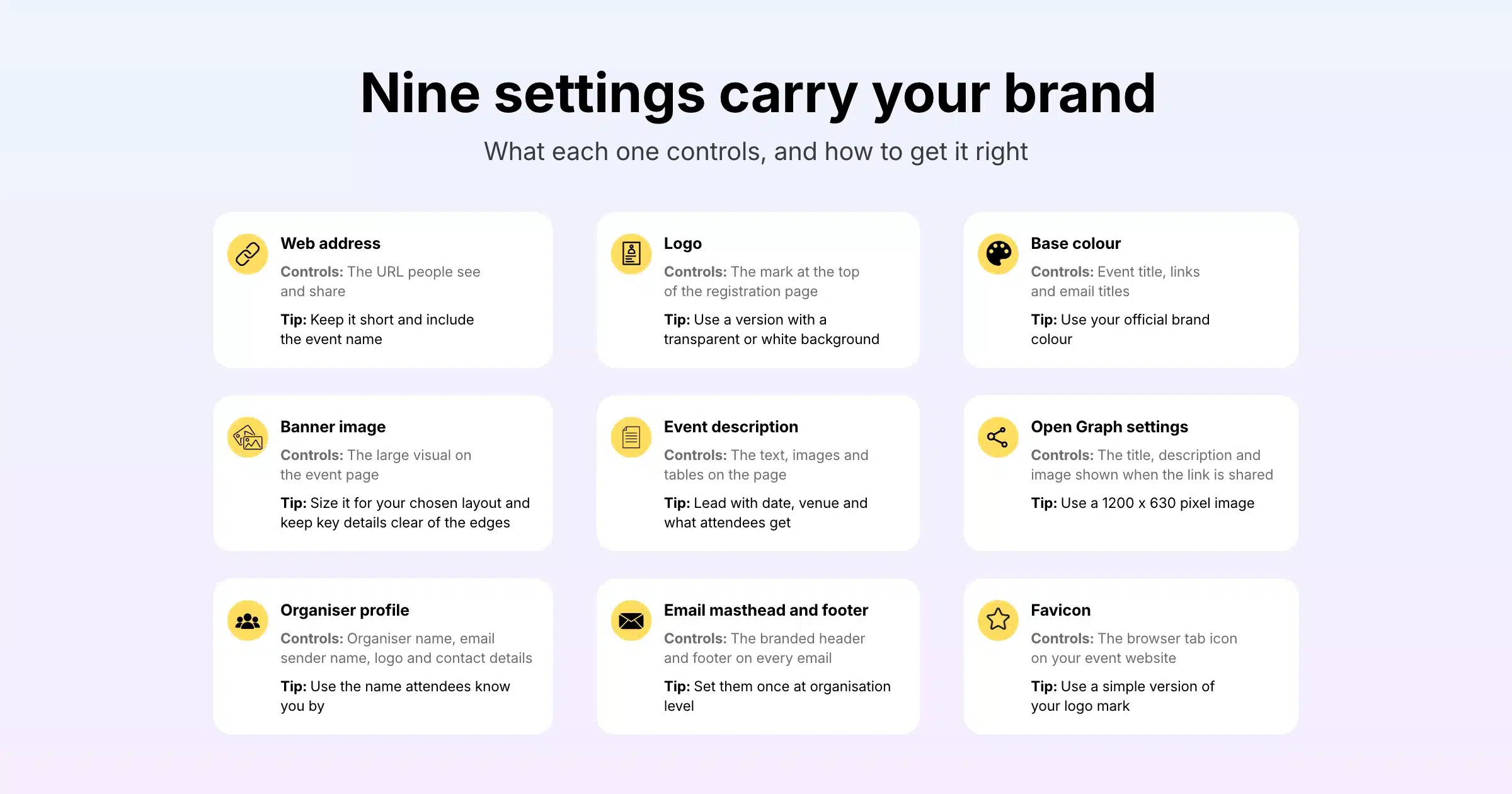
Most of your brand shows up through a handful of settings. The table below lists each element, what it controls and a quick tip for getting it right.
| Element | What it controls | Tip |
|---|---|---|
| Web address | The URL people see and share | Keep it short and include the event name |
| Logo | Shown at the top of the registration page | Use a version with a transparent or white background |
| Base colour | Event title, links and email titles | Use your official brand colour or the closest match |
| Banner image | The large visual on the event page | Size it for your chosen layout and keep key details clear of the edges |
| Event description | The text, images and tables on the page | Lead with date, venue and what attendees will get |
| Open Graph settings | The title, description and image shown when the link is shared | Use a 1200 x 630 pixel image made for sharing |
| Organiser profile | Organiser name, email sender name, logo and contact details | Use the name attendees know you by |
| Email masthead and footer | The branded header and footer on every email | Set them once at organisation level |
| Favicon | The small icon in the browser tab on your event website | Use a simple version of your logo mark |
Web Address
The web address is the first part of your brand that people see, often before the page even loads. In Gevme Registration, each event has its own web address, and every address is unique. So choose one that is short, readable and clearly tied to your event, such as the event name and year.
Logo
Your logo appears at the top of the registration page. If no logo is uploaded, Gevme shows the event name instead, which works but looks less finished. You can switch the logo on or off in the event page settings, so you control exactly when it shows.
Base Colour
The base colour is used for key elements such as the event title, the titles in your email campaigns and links. Pick your official brand colour, or the closest match, and check it has enough contrast against white so text stays easy to read. If no banner image is uploaded, the banner area fills with this base colour.
Banner Image
The banner is the largest visual on the page, so it carries a lot of your brand. Each registration layout uses a different banner shape, so size the image for the layout you pick (see the dimensions table later in this guide).
Event Description
The event description supports formatted text, images, tables, hyperlinks and even emojis. Images and tables can be up to 550 pixels wide. So use this space to sound like your brand, with the same voice you use on your website and in your emails.
Open Graph Settings
Open Graph settings control how your registration link looks when someone shares it on social platforms or messaging apps. You can override the title, the description and the image, with a recommended image size of 1200 x 630 pixels. These settings are restricted for private events that are invitation-only or password protected, since those links are not meant to be shared widely.
Custom Domains: Your Three Options
A custom domain is a web address you own, such as events.yourcompany.com, used in place of a platform’s default address. For event registration, you have three practical ways to put your registration experience under your own brand. Each suits a different type of event and team.
| Option | How it works | Best for | What attendees see |
|---|---|---|---|
| Gevme event web address | A unique, readable web address for each event in Gevme Registration | Fast setup, one-off events, teams without web support | A clean event address with your logo, colours and banner |
| Registration embedded on your website | Gevme’s tickets widget, CTA button, text link or calendar widget added to a page on your own site | Teams who want registration to live on their main website | Your own website, with Gevme registration inside it |
| Event website on your custom domain | A full Gevme Omnichannel event website connected to your own domain, with Gevme branding hidden on paid plans | Conferences, series and hybrid events that need a full event site | Your domain, your favicon and your design throughout |
Option 1: A Clear Gevme Event Web Address
For many events, a well-named event web address is enough. It is quick to set up, it works the moment you publish, and with your logo, colours and banner in place, the page still looks like your brand. That is why this option suits internal events, smaller seminars and teams running many events with short lead times.
Option 2: Embed Registration on Your Own Website
If you want registration to sit on your main website, Gevme Registration lets you embed it. The tickets widget lists every ticket on sale and can be added with a script or an iFrame. You can also add a call-to-action button (with your own text, background colour and font size), a simple text link, or a calendar widget showing your upcoming events. As a result, attendees browse your website, see your header and navigation, and register without feeling they have left.
This option works well when your website team controls the page design, or when you want registration traffic counted on your own domain. The Gevme Registration knowledge base walks through each embed option.
Option 3: A Full Event Website on Your Custom Domain
However, for conferences, event series and hybrid events, a full event website gives you the most control. With Gevme’s event website builder, you can host the site on your own custom domain, add your own favicon so the browser tab carries your brand, and hide Gevme branding from public pages on paid plans for a fully white-label site. Gevme branding appears on public pages by default and stays on the Free plan, so check your plan on the pricing page if a white-label site matters to you.
Confirmed registrations from Gevme Registration sync into Gevme Omnichannel in real time, so the event website, the virtual venue and the registration data all stay connected.
Preparing Your Logo and Banner Images
Good branding starts with good files. Indeed, a blurry logo or a banner with its text cut off undoes the work in every other setting.
Logo Files
Prepare your logo as a high-resolution PNG with a transparent background, plus a white version for dark backgrounds. Keep some space around the logo so it does not look cramped, and avoid long taglines that become unreadable at small sizes. If your organisation has separate logos for the company and the event, decide which one leads on the registration page and stick with it across emails and badges.
Banner Dimensions by Registration Layout
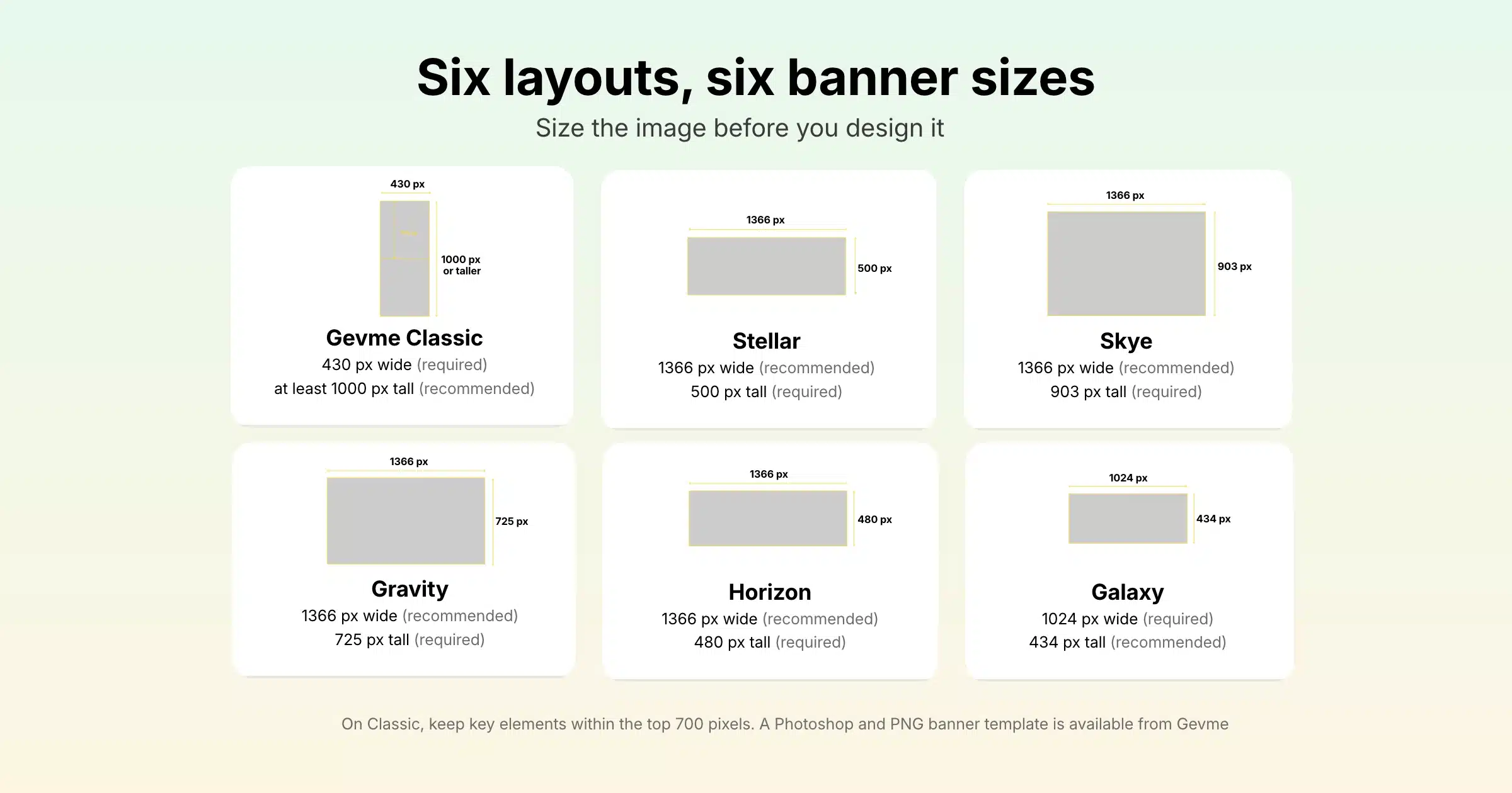
Gevme Registration offers several event page layouts, and each one uses a different banner shape. Size your banner for the layout you choose:
| Layout | Width | Height |
|---|---|---|
| Gevme Classic | 430 px (required) | At least 1000 px (recommended) |
| Stellar | 1366 px (recommended) | 500 px (required) |
| Skye | 1366 px (recommended) | 903 px (required) |
| Gravity | 1366 px (recommended) | 725 px (required) |
| Horizon | 1366 px (recommended) | 480 px (required) |
| Galaxy | 1024 px (required) | 434 px (recommended) |
For the Classic layout, which uses a tall vertical banner, keep key elements within the top 700 pixels of the image so they stay visible. In addition, Gevme provides a banner template file in Photoshop and PNG formats to help your designer get the proportions right.
Banner Design Tips
Above all, keep the banner simple: event name, dates, a strong image and perhaps one short line about the theme. Avoid putting essential details such as the venue or the price only in the image, because screen readers cannot read them and they may be cropped on some screens. For this reason, repeat anything important in the event description as text.
Registration Layouts, Landing Pages and Website Themes
Themes and layouts decide the overall look of your pages, so the choice matters as much as the logo and colours you add on top.
Registration Page Layouts
The six registration layouts listed above give you different arrangements of banner, description and ticket area. Gevme Classic uses a tall side banner, while layouts such as Stellar, Skye and Horizon use a wide banner across the top. So pick the one that suits your imagery. For example, wide landscape photos suit the top-banner layouts; portrait artwork suits Classic.
Custom Landing Pages
Gevme’s event registration software includes out-of-the-box landing page designs across various themes, which you can customise to suit your brand. Custom landing pages are part of the Registration Pro plan, along with email templates and Google Tag Manager, so teams that run many branded events usually start at that level.
Event Website Themes
For full event websites, Gevme Omnichannel offers a Themes Marketplace with 50+ ready-made themes and experiences, including 2D, 3D and mixed designs. Then you can start from a ready-made template or a blank page and customise it with your own logo, colours, backgrounds and content. Experiences are ready-made page bundles, such as a one-day conference with multiple tracks, which save time when you need several pages to look consistent.
Custom themes are available on the Omnichannel Pro plan for teams that want a design built entirely around their brand. Alternatively, for smaller adjustments, custom CSS can be added through an HTML block on a single page, or through the settings of the LiveBar, the header or an individual content block. JavaScript is not supported in these fields, so any script tags are removed.
Mobile and Device Preview
In fact, many of your visitors will arrive on a phone, especially from social media and messaging apps. The Omnichannel editor includes a live preview on desktop, tablet and mobile. Then check that your logo is readable, your banner crops cleanly and your buttons are easy to tap on a small screen.
Keeping Your Brand Consistent After Someone Registers
Branding does not stop when someone clicks the register button. The confirmation page, emails, tickets and onsite materials all shape how professional your event feels.
Confirmation and Acknowledgement Pages
After registering, attendees see a confirmation page, or an acknowledgement page if payment is pending. Both can be edited with your own content, and the text supports HTML for formatting. When the order summary is shown, your organiser logo and name appear in the side panel, and you can choose whether to display the organiser name. You can also add a call-to-action on the confirmation page, such as a link to add the event to a calendar or download the event app.
Branded Emails
Organisation admins can set a default email masthead and footer that is added automatically to every email template, across all events in the organisation. If the admin allows it, individual users can remove the masthead and footer from a specific email. Combined with a recognisable email sender name in your organiser profile, this makes every message from your event instantly familiar. Gevme sends from events@gevme.com by default, and email or domain whitelisting is available if you want messages to come from your own address.
Tickets, Badges and the Event App
E-tickets carry a unique QR code and attach to the confirmation email, and the badge editor lets you design onsite badges in your brand. For the event app, a white-label version of the Gevme event mobile app is available on Enterprise plans, so attendees see your brand from registration to the last session.
How to Brand Your Event Registration Page in Gevme
Here is the order we recommend when setting up a branded registration page in Gevme.
- Set up your organiser profile. Add your organiser name (shown on the event page footer, confirmation pages and invoices), email sender name, organiser email, logo and contact details.
- Create the event and choose its web address. Use a short, clear address with the event name. Every web address in Gevme is unique.
- Upload your logo and set the base colour. Use your official brand colour so the event title, links and email titles match.
- Pick a layout and upload your banner. Size the banner for that layout using the dimensions above.
- Write the event description. Lead with the date, venue or format, and what attendees will get. Add images or tables up to 550 pixels wide.
- Set your Open Graph title, description and image. Use a 1200 x 630 pixel image designed for social sharing.
- Choose what shows on the landing page. Toggle the event venue map, a link to your event website, social links and your logo.
- Customise the confirmation and acknowledgement pages. Add your own message and a clear next step.
- Check your email masthead, footer and sender name. Make sure the confirmation email looks like the rest of your communications.
- Embed registration or connect your custom domain if needed. Add the tickets widget to your website, or connect your domain and favicon to your Omnichannel event website.
- Preview on desktop and mobile, then publish. Click through the full sign-up journey yourself before sharing the link.
Common Branding Mistakes on Registration Pages
| Mistake | What happens | Fix |
|---|---|---|
| Low-resolution logo | The page looks rushed and less trustworthy | Upload a high-resolution PNG with a transparent background |
| Banner sized for the wrong layout | Text and faces get cropped | Use the banner dimensions for your chosen layout |
| Key details only in the banner image | Mobile and screen reader users miss them | Repeat date, venue and price in the description |
| Default social sharing image | Shared links look generic on LinkedIn and WhatsApp | Set a custom Open Graph image and description |
| Unfamiliar sender name | Confirmation emails get ignored or flagged | Use the organiser name attendees know |
| Different colours across page and emails | The journey feels disjointed | Set the base colour and email masthead to match |
| Never tested on mobile | Buttons and banners break on small screens | Preview on mobile before publishing |
A Few Terms Worth Knowing
- Custom domain: a web address you own, such as events.yourcompany.com, used for your event pages.
- Open Graph: the settings that control the title, description and image shown when a link is shared on social media or messaging apps.
- White label: removing the platform’s own branding so pages show only your brand.
- Favicon: the small icon that appears in the browser tab next to the page title.
Pro Tip
Build a one-page brand kit for your events before the next registration goes live: your logo files, base colour code, a banner template sized for your favourite layout, a 1200 x 630 sharing image, your organiser name and sender name, and two or three sample sentences in your brand voice. Save the finished event as a template in Gevme Registration, then clone it for each new event. As a result, every future registration page starts fully branded, and your team only has to change the dates, the banner and the description.
Frequently Asked Questions
An event registration page is the web page where people sign up or buy tickets for an event. It usually shows the event details, the tickets or registration options and a form that collects attendee information and, for paid events, payment.
Yes, you can put registration under your own domain in two ways with Gevme. You can embed Gevme registration on your own website using the tickets widget, a button, a text link or a calendar widget, or you can host a full Gevme Omnichannel event website on your own custom domain.
You add your logo when you create or edit the event in Gevme Registration, and it appears at the top of the event page. The logo can be switched on or off in the event page settings, and if no logo is uploaded, the event name is shown in its place.
Your event banner size depends on the registration layout you choose. For example, Gevme Classic needs a 430 pixel wide vertical banner at least 1000 pixels tall, while Horizon uses a 1366 by 480 pixel wide banner. Check the layout table in this guide before you design the image.
Yes, you can hide Gevme branding from public pages of your Gevme Omnichannel event website on paid plans, giving you a fully white-label site. Gevme branding stays on public pages on the Free plan.
Set custom Open Graph settings for your event. You can override the title, description and image shown when the link is shared on social media and messaging apps, using a recommended image size of 1200 x 630 pixels.
Yes, confirmation emails can carry your branding. Your base colour styles email titles and links, your organiser profile sets the sender name, and organisation admins can add a default masthead and footer to every email template.
Conclusion: Make Every Click Feel Like Your Event
A well-branded event registration page earns trust in the first few seconds and keeps it all the way through payment, confirmation and the emails that follow. In short, decide your web address strategy early, prepare a clean logo and a correctly sized banner, match your colours, set up your sharing image and organiser details, and test everything on mobile. Then save the result as a template so every future event starts from the same strong base.
Gevme gives you each of those pieces in one place: unique event web addresses, logos, base colours, six registration layouts, custom landing pages, embeddable registration widgets, branded emails, and full event websites on your own domain with 50+ themes. If you want to see how your next registration page could look, request a demo and our team will walk you through it.