

Table of contents:
Why should an event registration landing page be efficient?
The key elements of an efficient event landing page
Tips for optimising your landing page:
- Platform
- Design
- Strong landing page copywriting
- Call to action
- Usability
- Common mistakes
How to determine the effectiveness of your landing page
Conclusion
If you’ve ever experienced the hustle and bustle of event planning, we don’t need to explain what an undertaking it is to deal with thousands of tasks on your list at once. Still, an event registration landing page is the one thing that you simply can’t ignore. To begin this article,we’ll explore the perks of having an extremely worthwhile event registration page.
Why should an event registration landing page be efficient?
An event landing page is responsible for generating registrations, which is the principal reason for its importance. Event managers invest huge amounts of resources, time, and effort into maximising the impact their events can produce for the attendees. However, all of that is in vain if the target audience does not make it to the venue. Launching an efficient event landing page is the best prerequisite for facilitating attendance.
The key elements of an efficient event landing page
The best event landing pages follow a certain structure. Here are the essential “must-haves” that a seamless event registration page includes:
- Event details. It’s not one of those “asmuchaspossible” deals, but listing the principal details about your event on the registration page is the gold standard. Let people find out about the key dates, venue location, and event agenda to help them understand whether they actually want to be there. Additionally, you should provide a map and some tips on choosing transportation and lodging. This will be highly appreciated by your attendees. Talk about the things you would want to know when making the decision to attend, but don’t overdo it. Having tons of information on one page can be confusing.
- Ticketing information. An event registration landing page should clearly present the conditions for participation. Highlight the details on ticket types and prices to help people understand whether they will be able to participate.
- Value offer. Purposeful events always have missions behind them. Communicate the values and messages that your event entails, and inform prospective attendees about the benefits they will reap by attending.
- Sign-up form. Registering a person for an event also means establishing a dialogue with him or her. By capturing the essential contact data in sign-up forms, you establish the channels for contacting registrants in the future. To simplify the process for event registrants, you can pre-populate some
- CTA. There should always be a highly visible spot for a clear calltoaction in your event landing page design. Remember: The more event registrants that click on the “submit” button, the higher event conversion rates you will achieve.
- Mobile optimization. Say hello to the use of mobile devices! By catering to mobile, you ensure that your event registration form is available on any device, thus maximising the registration rates.

- Social sharing. Event registration pages are great platforms for sharing your social media links. Let people connect to your organisation, track updates about the event, and discover engaging ideas that might resonate with their interests.
- Support. Even if you think that everything everyone needs to know is on your event registration page, information on how to get some extra help is a must. Provide the link to the FAQ section, some contact information, and the details about the client’s support service.
- Thank you page. This is not only about being polite to your event registrants. Effective thank you pages can help you extend the buyer’s journey by providing links to resources or encouraging further action.
Tips for optimising your landing page
There are many ways to build the perfect event registration page for an event. When it comes to copywriting for landings, as well as design and event registration page examples, there are so many secrets, tricks, tactics, and nuances to deal with that you should definitely use some tips and tools to make your work more optimised and clearer. There are also vital landing page components that should act as your key landmarks in building a successful site for the event.
Platform
Start building a landing page for event registration by choosing the right platform. With the offerings of advanced website builders, you do not need to know how to code to create a beautiful and customisable event page. One option you should consider is GEVME Website Builder. This application provides ready-to-use templates for your website and allows customisation of the content blocks to your liking. If you expect to craft a seamless event registration landing page in just a few clicks, that’s your ideal choice!
Design

If you want to encourage registrations, make people fall in love with your event landing page design. Although it’s not the principal factor behind making attendance decisions, the optimized UX definitely plays a huge role. To create a conversion-centric design, choose the platform that provides the most effective templates. Pay attention to the positions of CTAs, and select appealing colour schemes that resonate with the event branding to create the best event landing page design.
Remember that you have only three seconds to make an impression on your potential visitors, so you don’t have time to demonstrate your extensive vocabulary in pattern sentences. Instead, it is better to use strong design. No matter how cool the text is that you write, it will not work if the reader is not comfortable enough to perceive it. Therefore, make sure that the appearance of the content has a strong visual appeal.
Strong landing page copywriting
It’s about more than having the right calls to action that decide how big your conversion at your conference registration landing page will be. Remember, a visitor only needs a few seconds to understand where he or she should go next. If, literally at one glance, a person does not understand what you are proposing and what he or she needs to do, they will more than likely leave.
- Use items and lists to make it easier for visitors to perceive the essence of your offer.
- Do not forget to divide parts of the text into subtitles.
- Choose an appropriate font size so that the text can be read easily on all devices.
- Remember that the text and background colours must be contrasting for the text to be readable.
- Highlight key points (in bold, italics, or other fontcolours).
Choose a platform that allows for the customisation of content blocks, and fill your event registration landing page with all the best flavours. The recipe for success is quite simple: Avoid vague and lengthy sentences, make a valuable plan of action the star, highlight the agenda and speakers, and don’t forget about major event details.
Call to action
A landing page for event registration cannot exist without a strong CTA in the right place according to the UX rules and the users’ behavior principles. Magic words like “Learn more”, “Get it now”, “Use for free”, “Register”, “Start now”, “Start check-in”, and others describing the final result that the client will receive by accepting your offer should be placed in the right website spots. They are called CTAs because they directly indicate what people should do and help with conversion growth.
The position and appearance of your event registration page CTAs dictate the actions that users should take. Make sure that they are wellpositioned and noticeable. To make them shine, you can add some contrasting colours to the buttons or change the sizes or format. Check out a few examples of this below:
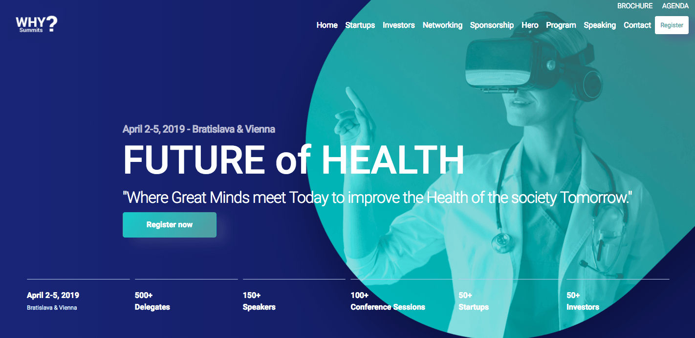
#1 Why Summit? uses the simple CTA: Register now.
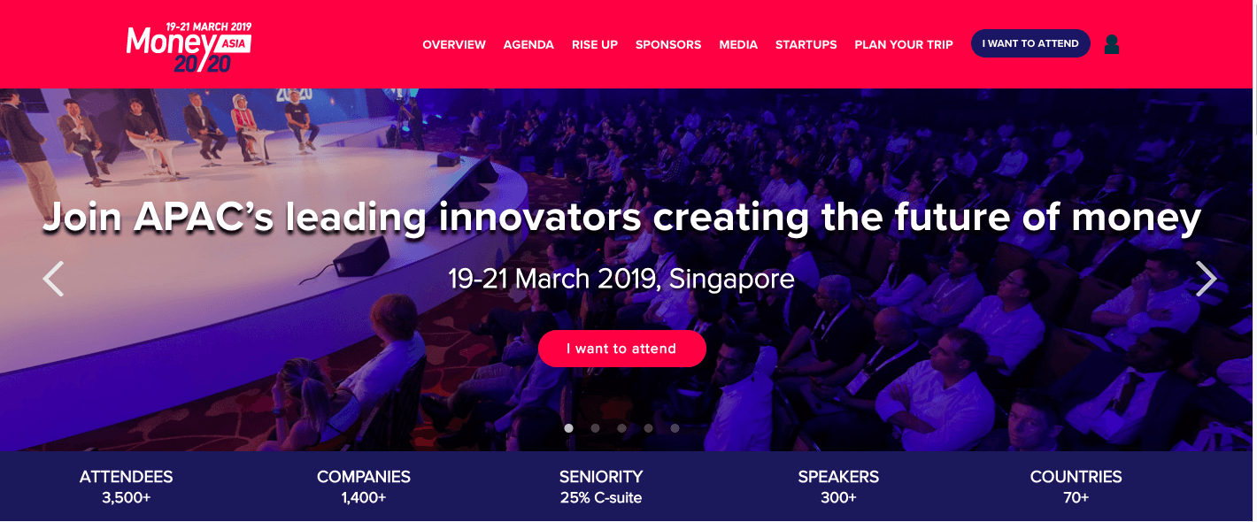
#2 Money 20/20 Asia team uses the first person appeal “I want to attend.”
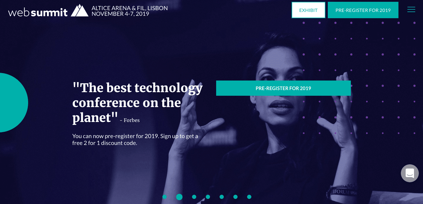
#3 If your event registration for the next event is not open yet but you want to make full use of the post-event coverage, you also can start collecting pre-registrations, which is what Web Summit organisers do. They published the CTA “Pre-register for 2019”.
Usability
Capitalise on registrations by optimising the usability of your event registration landing page. Make sure the website caters to mobile devices and can be accessed anywhere, anytime.
The best event registration landing page examples
Need some practical insights into the power of event registration? Check out these event landing page best practices and event landing page examples to fuel your creativity:
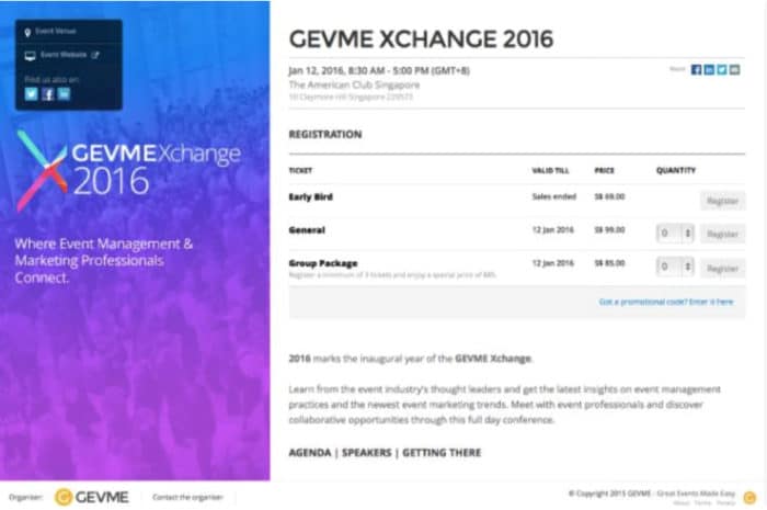
#1. Gevme Xchange 2016
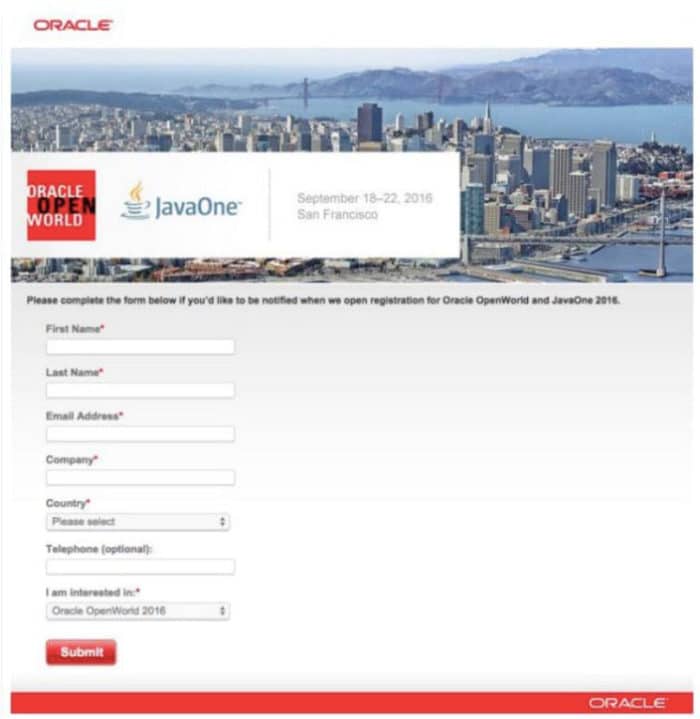
#2. Oracle
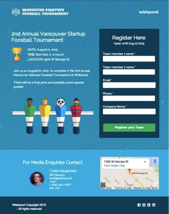
#3. Vancouver Startup Tournament
Common mistakes
Whatever you write about or whichever design you choose, you should always be ready to answer one simple question of a potential client: “What’s the point?” Or, to put it simply, “What now?” Why should visitors to your landing page spend their valuable time filling out an order / registration / subscription form? What is the value and benefit of your offer? Make it clear to them, and you will succeed with our event’s registration techniques.
How to determine the effectiveness of your landing page
Event landing page inspiration is a great motivation engine. However, all efforts with the copy or design will be in vain if you’re not allowed to measure your landing page performance effectiveness. Web analytics or alternative services will help you understand how well your page is optimised and how much conversion it brings.
Conversion Rate % = (# Event Registrants ÷ # Visitors to Your Event Website) x 100
There are three major landing page effect indicators:
- Bounce rate
The bounce rate can vary between 50–99%.
- ROI from the source
By combining ROI and traffic, you get a powerful indicator: ROI from the source.
- Average check
This stage of analytics may be conducted via the internal CRM of your business.
GEVME allows event analysis all in one and secures a high conversion rate.
Conclusion
The rate of event registrations depends heavily on how well the event landing page reflects the event’s unique assets. By creating an event registration website that emphasises all the key details, encourages action, and highlights the value of the project, you will get the most out of event marketing. With the use of an effective website-building platform and a bit of event landing page inspiration, you can significantly boost your attendance.
Test Gevme to experience automated event page creation in practice. Get started for free!


