Most people can intuitively guess that standard fonts are not quite what you need for your event website. This is completely correct: Standard fonts in landing page website design are boring. Font combinations for an event landing page with a selection of colour and their own features are much better. The major insider secret when choosing fonts for site design is Google web font combinations. Simply choose those that are freely available to make your website look outstanding.
Importance of a perfect font for your event website
By choosing the best font combinations for 2018, you’re making the right move because:
- There are no substandard fonts in Google Fonts.
- Such fonts are easily connected during layout, and there are no problems when displaying them on different browsers.
Here are some nice Google font combinations that are frequently used in the design of websites:
Amatic SC + Josefin Sans
Raleway + Roboto Slab
Copernicus + Proxima Nova
Playfair Display + Source Sans Pro
PT Sans Narrow + PT Sans
Kaufmann + NeutraDemi
Helvetica + Garamond
Cubano + Nunito
Proxima Nova + Georgia
Bodoni + Futura, etc.
A font that is ideal for body text size is 18–22 pt. This contrasts well with more sophisticated headline fonts, such as Lobster, Roboto Condenced, and thin Open Sans Light. These are probably the most popular font to build a perfect event registration landing page.
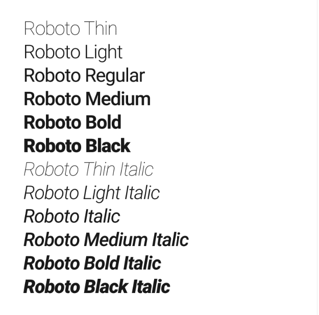
The Roboto font is the most suitable for headlines, especially the Condensed (compressed) Bold variety. It is advisable to make all the letters capitalised. PT Sans, for example, can be perfectly combined with Roboto. It will look even better if you take the Roboto Slab (squared font with serifs). Like all fonts from the same family, one of the best combinations is to use the same font, either with or without serifs.
Key great web font combinations requirements
The most important requirements for any font as an element of web design are its readability, technologic level, artistry, and efficiency.
- The readability of the font depends on a number of conditions. It is influenced by the features of typing and printing (line length, width of interlinear spaces, print clarity, colour of paint and paper) as well as reading conditions (for example, the amount of light). However, under the same reading conditions and the same type of character and print quality, the readability of the font depends on its size and pattern. That is why it’s so important to know how to use web font combinations, how to start/install them, how to brand the event, etc.
- In terms of the artistic requirements for the font and its artistic merit, we recognise the font as a phenomenon of graphic art. The most significant artistic fonts were created in the hype of certain art types and are stylistically linked to the graphic art of their time. Those fonts that met the practical requirements were primarily readable and corresponded to changing printing conditions; they continued to survive in subsequent epochs or exerted a strong influence on the further development of similar font forms.
- The technology of the font—that is, its ability to stably produce prints as accurately as possible—also depends to some extent on the font design. It was established experimentally that when typing, fonts with moderate contrast (or no contrast), short serifs, and fairly wide letter spaces are reproduced the most accurately. On the contrary, fonts with sharp contrast, long and almost merging serifs, and narrow intra-letter gaps become more distorted.
- Efficiency or the small size of a typographic font is determined by how many printed characters fit per unit of area. The use of economical fonts not only significantly reduces space consumption but also leads to a decrease in the volume (and, consequently, the cost) of event web design, and yet the economy of a font is useful only if it is not achieved at the expense of readability.
Top 10 event website combination trends
Besides the best Google font combinations for websites, there are event website trends that should also be considered when picking beautiful Google web font combinations. Here are some of them:
- Design is about solving problems.
- It should be adjusted for mobile devices.
- Highly vibrant colour schemes and neon palettes are still in vogue.
- Using gradients of colour in combination with brighter colour palettes is a good idea.
- Make your design responsive.
- Fewer forms (or boxes to fill in) will increase registrations and sign-ups and thus conversion.
- Include networking and attractions.
- Conversion triggers that are design elements, statements, buttons, and any other website elements that focus on luring website visitors to sign up, register, and make a purchase should be included.
- There are two important trends pushing the long scroll: social media and smartphones/tablets.
- Background animations and videos should be added.
These trends in website design and font choice may seem counterintuitive and even annoying, but online users prefer unification and clear, concise, and easily identifiable information. Always remember that!
Conclusion
As opposed to online jigsaw puzzles, web design font combinations must be clear so people can figure them out for themselves. Therefore, try to choose a font and design that align the best to make your event landing page both appealing and functional. Any combination you like should be well-adjusted or else it has no practical use.
You’re welcome to use the GEVME website builder or seek out event organisation tips to help you succeed with your event website.
Also, feel free to leave your own font-related suggestions in the comments below!
